Data Visualization Panel Displays Arrays of Data Flows
Kris Krug // Strategic News Service
Blood, airflow patterns, and Facebook all have flows that can be mapped and visualized. At the Future in Review conference, Chris Johnson, Bei Wang Phillips, and Alexander Lex opened Wednesday’s morning session by showing an array of data flows in visual forms.
Chris Johnson, the director of the Scientific Computing and Imaging Institute (SCI) said flows are everywhere in nature, from the living body to the social world. With intricate and colorful 3D representations, he presented visualizations of jet fuel on fire, a spiral galaxy with billions of stars flowing, and even tweets during the recent uprising in Turkey.
The purpose of understanding these flows is to learn how they work normally so that people can understand the aberrations. One aspect Johnson researches is the electrical flows in the heart. He showed a simulation of one beat of a heart over a second’s time. He also maps the brain and said that by modeling the brain, they can visualize an epileptic seizure. Once they understand that, they can work to treat it.
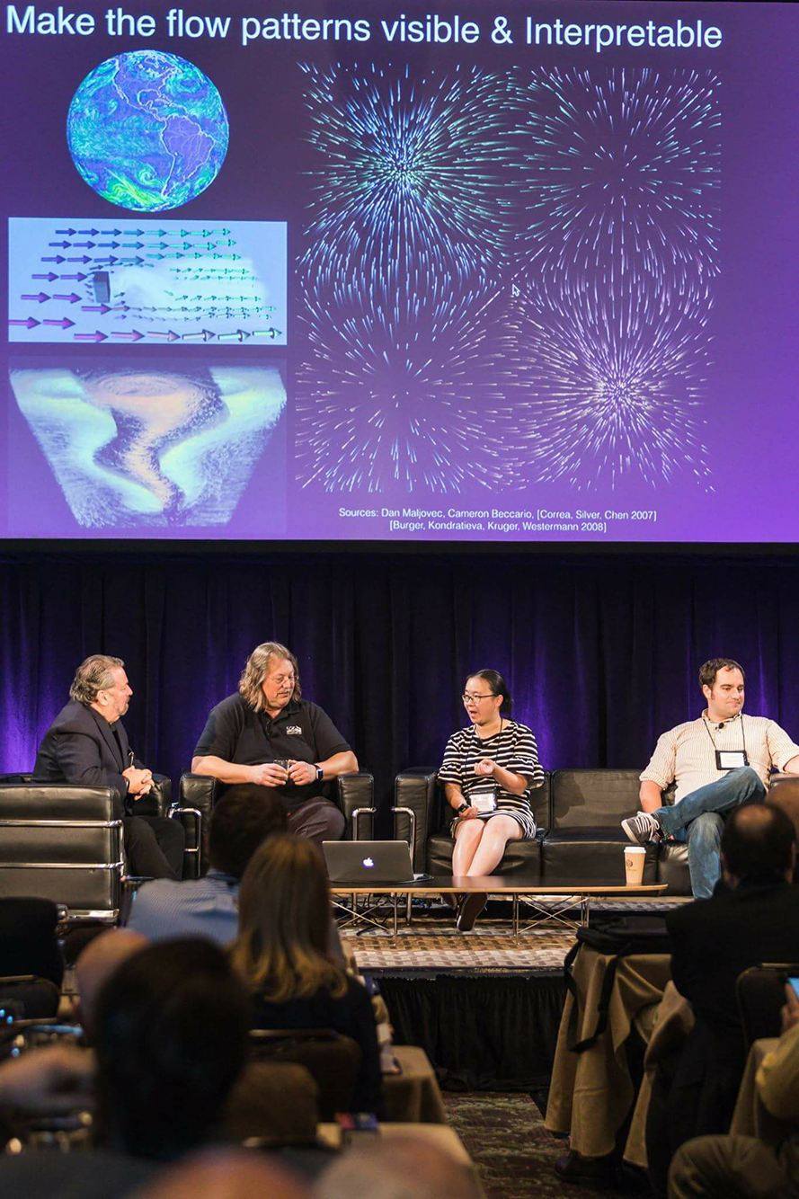
Bei Wang Phillips, an assistant professor of computer Science at SCI, continued the panel by going into more detail of why visualization is so critical to understanding data flows.
“The main point is to make it visible and make it more interpretable,” Phillips said.
Flows like wind have hidden patterns that require visualization to be understood. Bei showed detailed visuals of the ocean currents of the world and hurricanes. At the SCI, they look at the source, the sync, and the saddle, which are the features of the flow. They map the stability points of the flows and the noise.
Alexander Lex, also an assistant professor of computer Science at SCI, spoke on the difficulty of only mapping data points when dealing with big data and compared the resulting graphs to hairballs. The hairballs convey size and not much else.
“You cannot show big data; you have to take it parcel it down to be something discernible to the human eye,” said Lex.
To show a better way of breaking down big data, he demonstrated the use of a query interface. This allows users to drill down on the data into various flows.
“Data analysis is this combination computation, visualization, and human interaction with the data,” Lex said.
To discover more or read other articles from the conference, visitStratNews.com or our Medium blog.